Once upon a time, in the world, a protest…

A World of Protest
Nowadays, all the protests are not covered by the media. It’s thus difficult to have an idea of the number of protests in the world. Indeed, only in 2017, there have been more than 1 million of protests in 195 countries. With quick math, we understood why all these protest are not all relayed by daily news. This makes around 2740 protests by day. That seems a lot, but all the kind of protest are included in this count, from pacifist hunger-strike to violent revolt. We often think that, the richest countries have a lower rate of protests. Let’s see bellow it’s true…
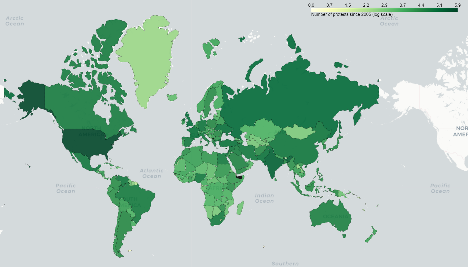
Distribution of protestations in the world since 2005
The map above shows the distribution of all the protests in the world since 2005. More the protests’ count is high, the darker is the color of the country. Countries in black are out of scale because there is no information about their protests’ count . First, we can think that the distribution is uniform around the world. However, by looking more closely, this is a logarithmic scale. The USA is a clear outlier, it may be a rich country but it as the highest protests’ count by far. In 2017, the US has hosted more than 200 000 protests. In other word, every time there is a new protest in the world, it has a probability of 20% to be the US.
But the US are not the center of the world, let’s remove this outlier, to visualize the rest of the world, with linear scale this time.
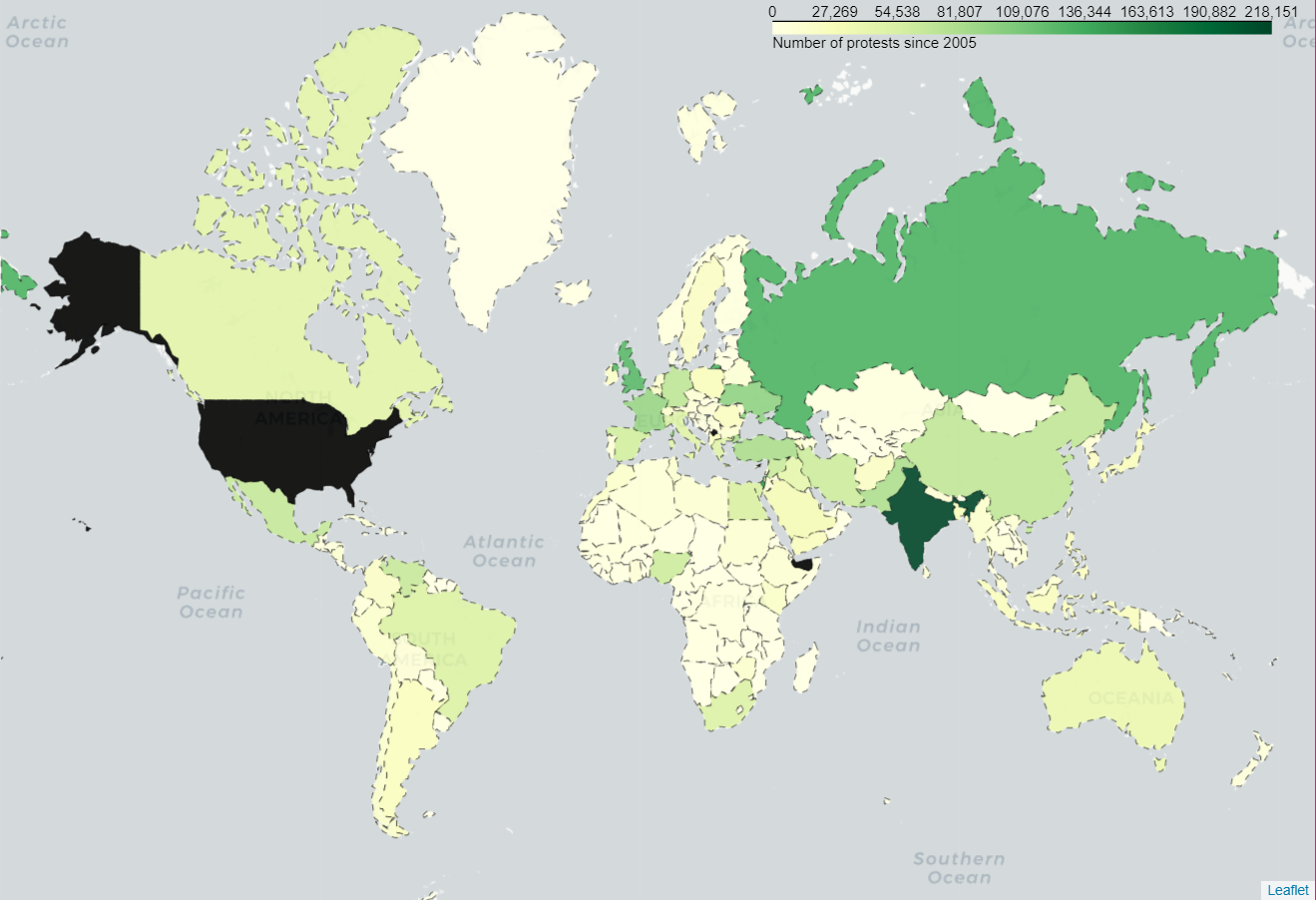
Distribution of protestations in the world since 2005 (without the US)
Despite having the US in black, this map brings much more information about the distribution of protests. India, Russia and United Kingdom have the highest count. There are almost no protests in Africa that is the poorest continent (maybe the information is not recorded in our database), but there are also only few protests in Scandinavian country which are rich countries.
The wealth of a country’s economy is maybe not the only indicator to look at. The world of protests seems to be a bit more complicated. India is the second country with the most protests. Nevertheless, in occidental country, we don’t hear about all of these protests. We thus decided to compare the visibility of the countries’ protests on the news. We displayed the average number of mentions per country for their protests.
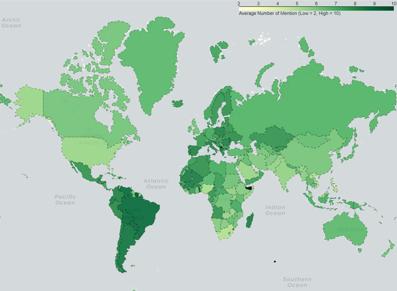
Map showing the protest average number of mentions by country
The number of mention mean the total number of mentions of an event across all source documents. Multiple references to an event within a single document also contribute to this count. It’s the image of the “importance” of an event. Countries that have the higher average of number of mentions are in Europe, in the North-West side of Africa, and in almost all the countries in South america.
We wondered the meaning of the “diagonal of high number of mentions” because all the countries with a high average are aligned. The interesting thing is that countries are regrouped in some kind of cluster where all the countries have similar average. Maybe the type of culture is correlated with the “importance” given to a protest.

We can make the assumption that in the US, many protests have a really low resonance on media because the protests’ count is very high and the average of number of mentions is quiet low.
In the other hand, in Scandinavian countries they don’t protest often , but when they do, everyone knows about it. They are not the only one in this case. It shows that either people are happy with their life condition and gouvernement policies or maybe they only shows their dissatisfaction for a really important topic or event.
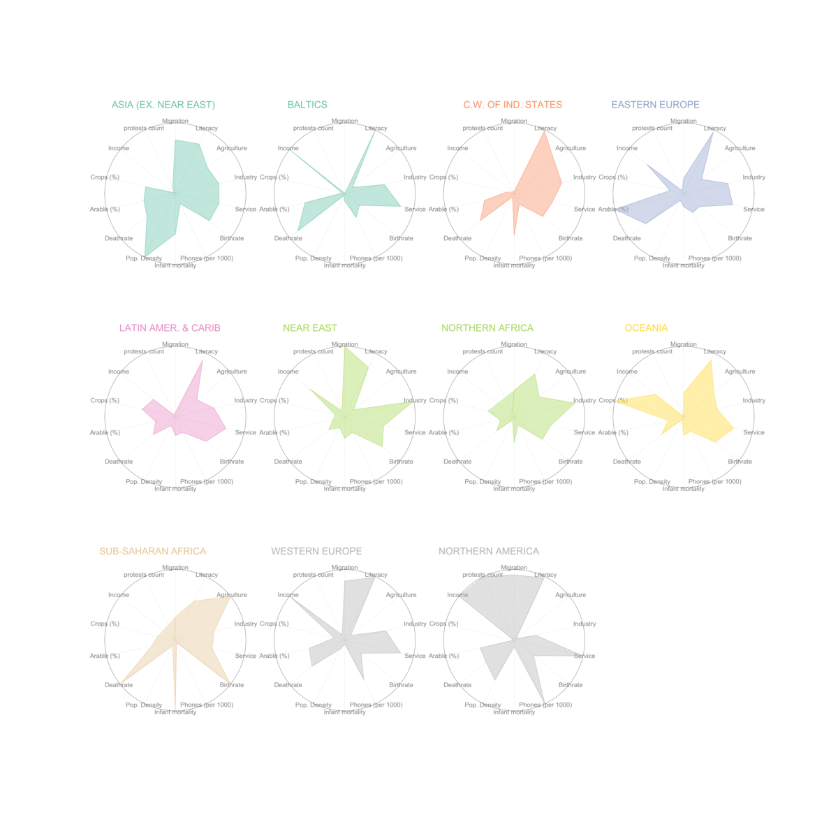
Influence of countries’ statistics on protests’ count
We wanted to find a way to visualize all the countries’ statistics with the protests’ count. The objective was to visualy find correlations between statistics and number of protests. We choose to visualize by region instead of country. The most relevant visualization was the following one:
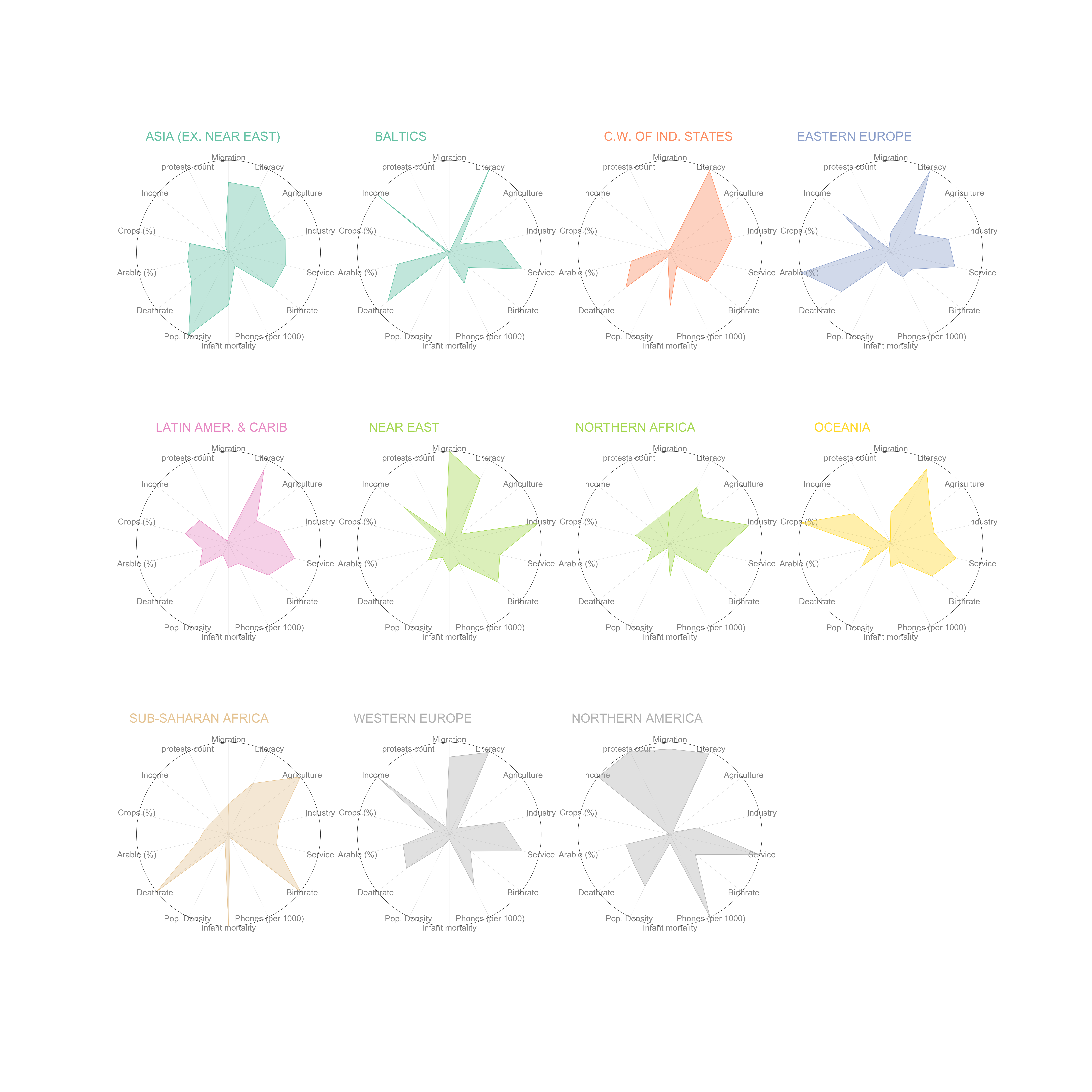
Countries’ statistics per region
Unfortunately, we got the same issue we got for the folium map about protests distribution. There are too many protests in the US to see anything in the other regions. We thus needed to visualize it without the US:
Animated image which shows the visualization’s result with and without the US
Without the US, we can now see differences between regions. Thanks to this visualization, we can find approximatively, which characteristics influence positively or negatively the number of protests. We can notice, for instance, the influence of the income or the industry percentage. Our analysis in the next section will go deeper into it. This visualizations was only to get an idea about our statistics available.
As a second visualization, we wanted to see the influence of the GDP Growth rate. To see it, we choose a bubble graph. We are displaying the GDP growth rate in function of protests’ count. Each bubble represents a country with a color based on the continent. The size of the bubble depends of the population’s density.
Thanks to this choices, we wanted to see if the countries in the same region has the same kind of move. We are displaying month by month:
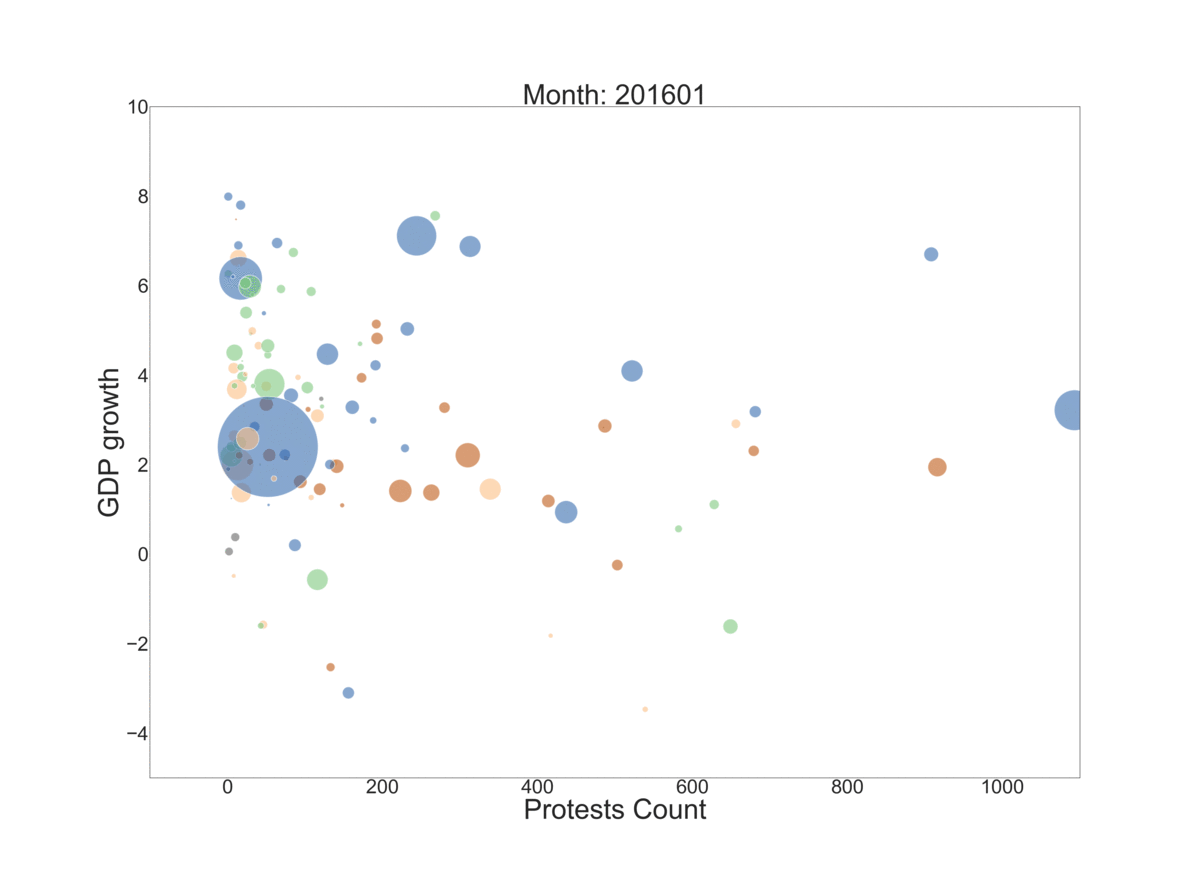
We can see that the bubbles stay grouped, especially for some regions. Let’s took an example to visualize what we detected:
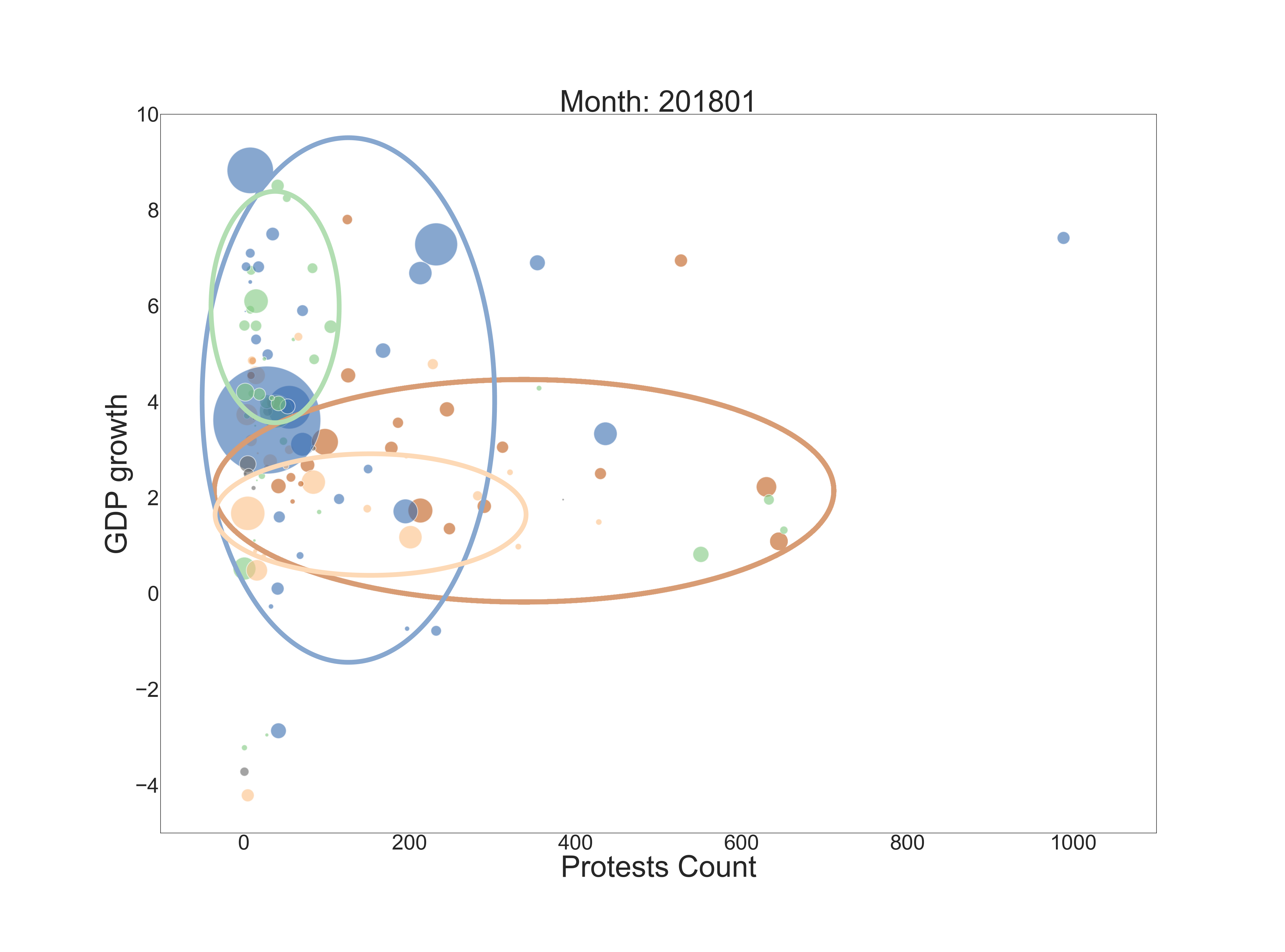
We can follow the regions during the animation, they keep this formation quite well. We can conclude from these visualizations above that the protests’ count seems to be correlated with regions and the countries’ statistics. Let’s do some analysis to confirm and quatify that.
Let’s move south
We see that the countries of the South American continent are demarking themselves by having large number of mention for they protests, which indicate their importance.
We thus decided to analyse more precisely the number of protests in function of different variables.
Analyzing the South America countries has the additional advantage of comparing countries with similar cultures and government style. They are of course different but they are more similar than say USA and China.
We want to discover which variable are significant to predict the number of protest in a country. The figure below shows the result of the regression with the statistical significance of the each one. The data were taken for each sovereign country in south america for the years 2015 to 2017.
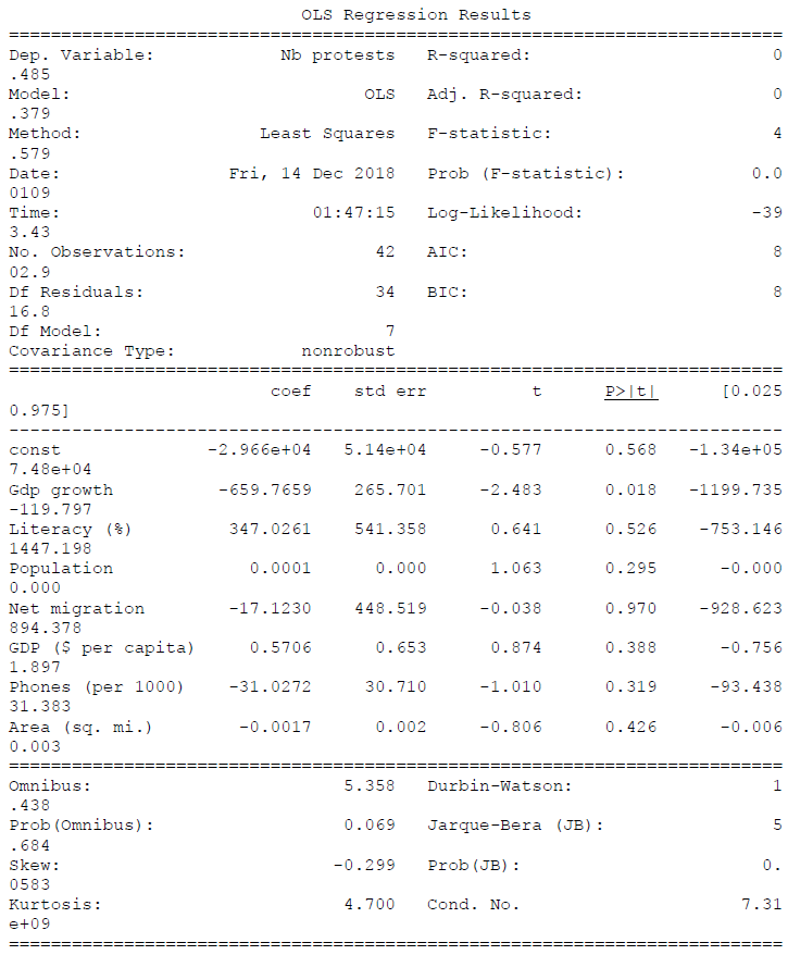
After removing greedily the least statistically significant features. We have the following result.
We see that only the constant term, the population and the gdp growth have a p value smaller that 0.05. These values are making sense. It seems evident that with a larger population the number of protest will be more important. And poor economic result may push more people to demonstrate to protect their standard of living. It is also interesting to see that the GDP per capita is not significant. It seems that people care more about the improvement or degradation of their condition that about their current condition.
Protest per month
We should also realize that a significant proportion of protest is nearly impossible to predict. We might identify situations where protests have a higher risk to occur. We found that the GDP growth is clearly inversely proportional to the number of protests. However, this is a general data on the year long and we cannot capture the burst of protest.
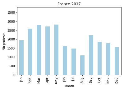
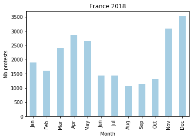
A very good example of this unpredictability of a spike in number of protests is the Arab spring (sadly the data did not contain this period). This movement has taken the world by surprise and of course after hand, we can see indicators telling us that a revolution was probable, but they are no reason why it happened at that time and not six months before or after. Another example is the jellow jacket movement in France, really who could have predicted that this small tax increase would have created such a backslash. At least we know that the French government did not predict it, they wouldn’t have done it otherwise. The number of protest in France is compared bellow between the years 2017 & 2018.
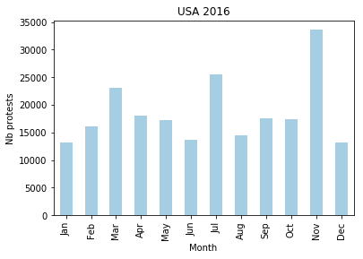
They are also situation where we can easily predict a large number of protests if an uncertain event occurs. A nice example is after an election. We have already talked about the election of Donald Trump, we can also look at the election of the next Brasilien president. In Italy the effect is more subtle (election in March 2018)).
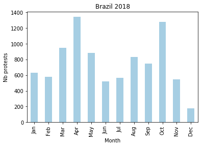
We see two peaks in October the election of Jair Bolsonaro and in April the confirmation by the supreme court of the imprisonment of the ex president Lula.
Animated map visualizations
As we have the location and the type of each protest, we wanted to visualize it on animated maps. These maps will show how the protests are shared and how they progress within a period.
Thanks to the “event code” information, we have access to the protest’s type. Indeed, people can protest for different reason. In our case, it can be for a leadership change, for right, it can also be a hunger strike, a boycott, etc. We thus decided to implement a map to visualize this data:
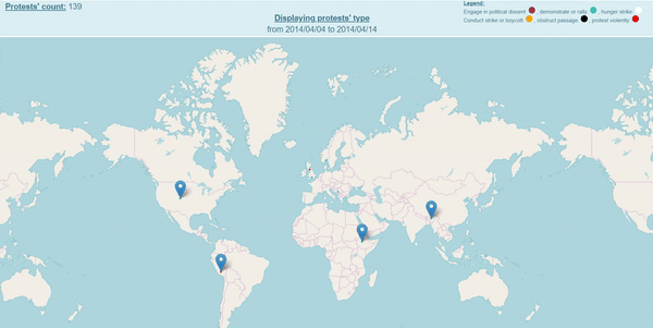
Note: here is an accelarated way, please open “visualizing_main_maps.html” in the main folder to see all of our visualizations
As you can see, we implemented an animated world map. It displays, day by day, each protest. We can see that, most of the time, the protest are a demonstrate or a rally. However, contrary to the rest of the world, in Europe, there is a high percentage of protests related to politics for the given period.
Let’s go far away. We wanted to see how often we get a protest on each area. To achieve this visualization, we changed the color code. As we are not interesting in the kind of protest anymore, we changed the color code to show the frequency of each protest instead of its kind.
The color of each point (protest) starts white, each time a new protest goes to the same location, the point becomes darker. We choose green as intermediate color.
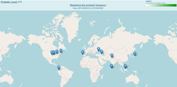
Images: Displaying protests with a frequency indicator
Note: here is an accelarated way, please open “visualizing_main_maps.html” in the main folder to see all of our visualizations
After few seconds, we can visualize the frequency of the protests. More darker is the circle, more the frequency is high. If we compare both maps, we can conclude that even though the Europe’s protests are more violent, they are less frequent.
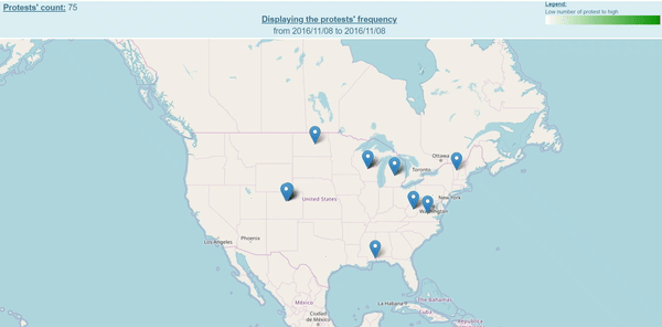
Nevertheless, we didn’t want to look at two different maps to know the kind and the frequency of each protest. We wanted to combine both visualizations. We were looking for a way to visualize, at the same time, the kind of protest AND the frequency of each of them. We choose to keep the first color code, where each protest’s kind has a color. However, we changed the way we are displaying the frequency. We are increasing the size of the circle, each time a protest goes to an area where other ones took place.
Here the result for the US, Australia and France:
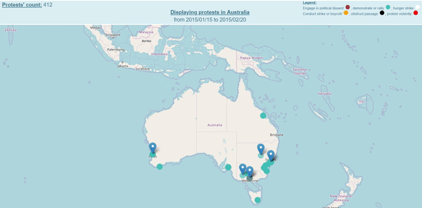
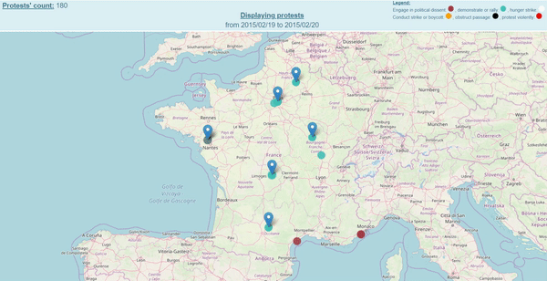
Images: Protests in the US, Australia and France on different periods
We can see, for the US and Australia, that the protest are mainly located on the East cost.
We then wanted to find relations between news and our visualizations. We did two study cases to verify the correlation between events and protests’ number.
STUDY CASES
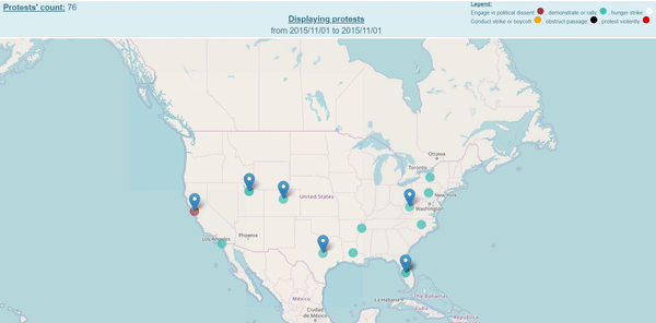
1- Spoiler alert: Trump won

Protests in the US around the 2016 presidential elections period 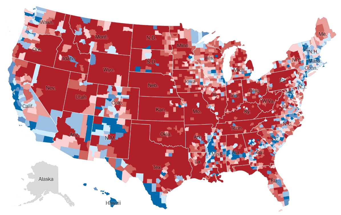
2016 Presidential Election Results: by counties
Source: https://www.nytimes.com/elections/2016/results/president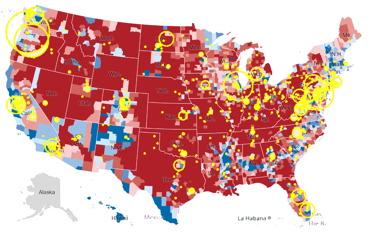
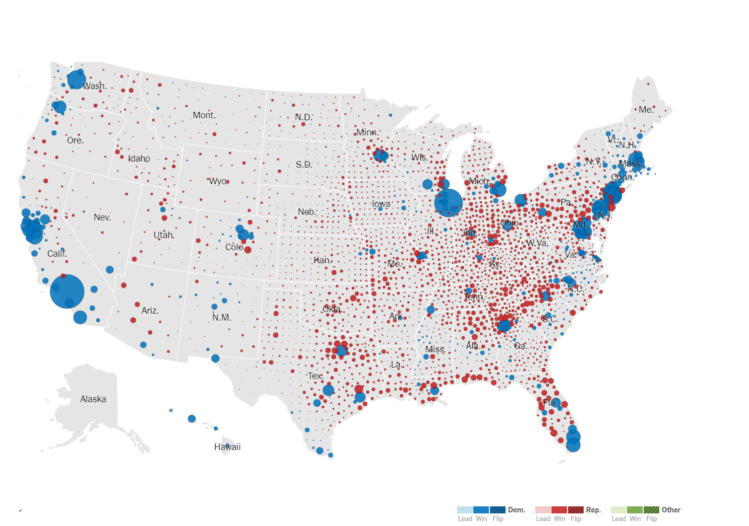
Counties’ results and protests’ location maps combined
Our visualization on the left allows to quickly visualize protests’ intensity on a period, here:
between 11/06 and 11/05 2016. The red circle shows the location and the protest count in a same region. Higher is the protests’ count, larger is the circle. The density of protest is much more import in big cities: Chicago , New York, Los angles, Washington, San Francisco, Miami , Seattle and Portland. We want to compare these protest location with the result map of the US elections of 2016.
We found maps of the result of the Presidential Election on the New York times web site.
The map on the center is showing the results for each county, Hilary Clinton’s electorate is in blue, the one of Donald Trump is in red.
On the last map, we superposed both information about the protest density (we changed the color from red to yellow to have a better visualization) after the result of the election and the map of the results. The protest matches perfectly the counties won by Hilary Clinton ( in blue ). The story is that after the results, a lot of american people who voted for Hilary Clinton, did not accept the result. The protests’ count exploded the months after the result, mainly in democratic states. But how can we explain the difference of protest count between ‘democratic’ counties.
We can make the assumption that there was more protest in counties where Clinton had larger lead.
2016 Presidential Election Results: size of lead
Source: https://www.nytimes.com/elections/2016/results/president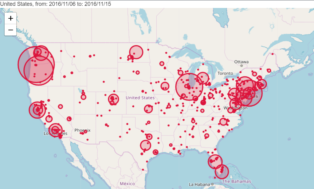
Protests in the US around the 2016 presidential elections period
The 1st map is showing the lead of each candidate, The circle size is proportional to the amount each county’s leading candidate is ahead. Again, the democratic party is in blue and the republican party is in red. Our assumption was correct, we can see that the
counties where Hillary Clinton was leading far ahead had much more protests than other counties also won by Hilary Clinton. For example, in Albuquerque(New Mexico) the lead was
less important than in Chicago. There was almost no protest in Albuquerque and in Chicago there were many protests.
We then wanted to display the protests evolution around this date:
Our visualization strongly confirms that there were many protests in a political aspect (red color) in the US around the elections’ dates. Thanks to this kind of visualization, we could detect if the protests become more or less frequent day after day.
2- Catalan move
Catalonia is a region in north-East of Spain, the capital of Catalonia is Barcelona. This is the richest region of Spain and the 1st October 2017 they had a referendum to know if they should have their independence from Spain. There has been a huge repression from the Spanish gouvernement in Barcelona. Let’s see the number of protest during this period.
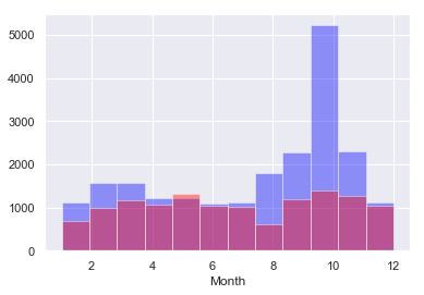
We can clearly see the number of protest rising on October 2017. When we compare with 2016, we can see that we got almost 5 times the number of protests in 2017.
Let’s see the geographic distribution of these protest and compare them with another year:
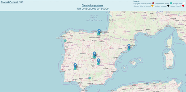
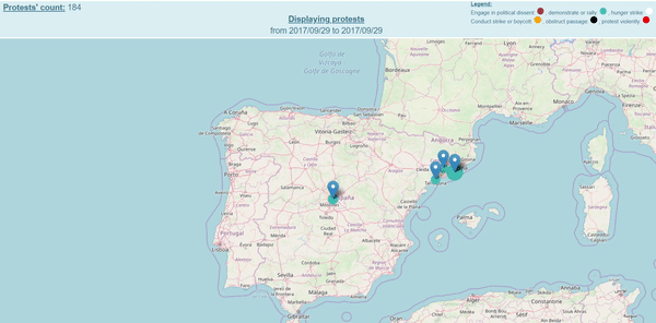
Images: protests in Spain from 29th August to 2nd October 2016 and 2017
Thanks to the visualizations above, we can compare the protests’ number distribution, day after day, between 2016 and 2017. As the referendum took place on the 1st October 2017, we displayed the protests from the 29th August to the 2nd October.
We can see that the protests mainly took place in Madrid and Barcelona and were strongly more important in 2017 around the referendum.
Conclusion
As you saw, we tried many kind of visualizations to find correlations. We wanted to show how the characteristics of the countries influence the protests’ count. We found that the protests’ count doesn’t really depend of the countries’ characteristics. However, we showed that protests most appear in certain periods (~April, ~September), certain countries are more predestinated for the protests like the US and we found where the protests are the most covered by the media.
The events are the biggest cause of the protests. Indeed, even though we have few protests in a country with specific characteristics, a political event can lead to many protests. But the political events are not the only kind of event we saw: Dallas police shooting on July 8th 2016 (https://www.telegraph.co.uk/news/2016/07/09/dallas-police-shooting-as-it-happened-july-8th-2016/) led to many protests too. Our study cases showed that the protests’ count are strongly correlated to events. Plus, when we are grouping our database on dates, we found that the protests are grouped on certain dates correlated to events. For instance, on July 8th 2016 we got more than 1,000 protests in 3 days for the Dallas police shooting.
Remark:
PLEASE OPEN: “visualizing_main_maps.html”
in the main folder to see our main visualizations in one HTML page format.
